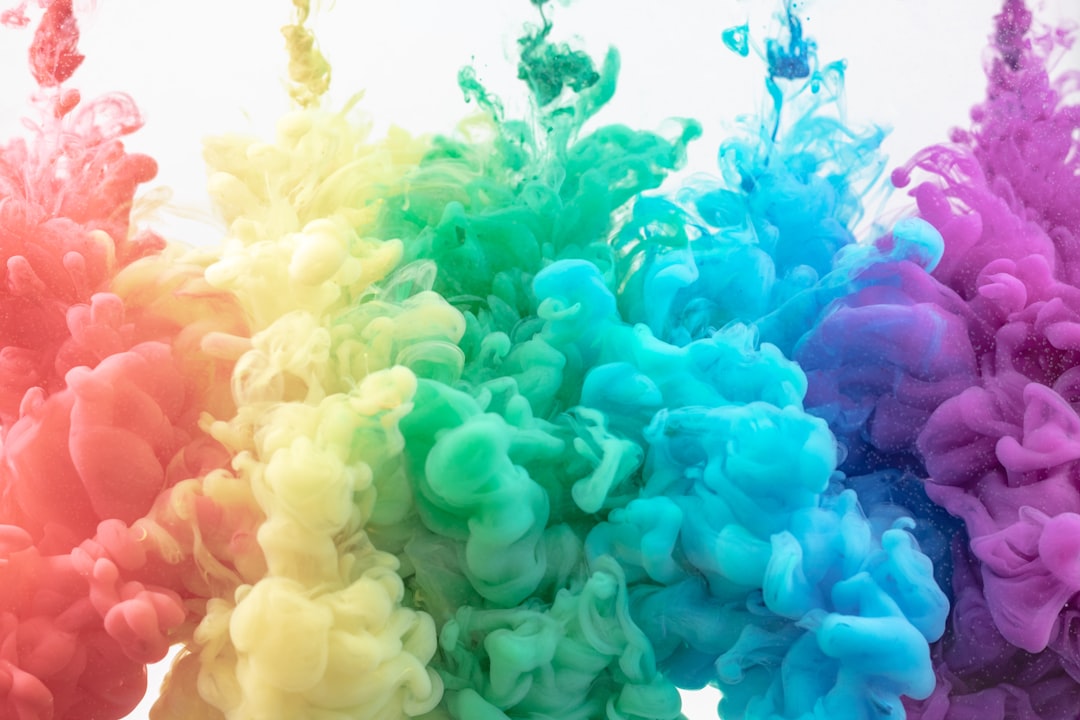
Color plays a pivotal role in shaping user experience across digital platforms. It is not merely an aesthetic choice; rather, it serves as a powerful tool that can influence how users perceive and interact with a website or application. When users visit a site, their initial impressions are often formed within seconds, and color is one of the first elements they notice.
A well-chosen color scheme can evoke feelings of trust, excitement, or calmness, thereby setting the tone for the entire user experience. Conversely, poor color choices can lead to confusion or frustration, potentially driving users away. Moreover, color can significantly affect usability.
For instance, colors that are too bright or clashing can distract users from important content, while a harmonious palette can enhance readability and navigation. Designers must consider not only the emotional impact of colors but also their functional implications. A thoughtful approach to color can create a seamless experience that guides users intuitively through a website, making it easier for them to find information and complete desired actions.
Key Takeaways
- Color can significantly impact user experience on a website, influencing emotions, behavior, and attention.
- Color plays a crucial role in branding and identity, helping to convey a brand’s personality and values.
- Different colors are associated with various psychological meanings, which can influence how users perceive a website.
- Choosing the right color palette for a website is essential for creating a cohesive and visually appealing design.
- Color can affect user behavior and emotions, making it a powerful tool for creating engaging and impactful web experiences.
The Role of Color in Branding and Identity
Color is integral to branding and identity, serving as a visual shorthand that communicates a brand’s values and personality. Companies often invest considerable resources in developing a color palette that resonates with their target audience and reflects their brand ethos. For example, blue is frequently associated with trust and reliability, making it a popular choice for financial institutions.
In contrast, vibrant colors like red or orange may convey energy and excitement, appealing to brands in the entertainment or food industries. The consistency of color usage across various platforms reinforces brand recognition. When users encounter a specific color associated with a brand, it triggers memories and associations that can influence their purchasing decisions.
This phenomenon underscores the importance of strategic color selection in marketing campaigns and product design. A cohesive color strategy not only strengthens brand identity but also fosters customer loyalty by creating a familiar and inviting environment.
The Psychological Associations of Different Colors
Colors evoke specific psychological responses that can vary across cultures and contexts. For instance, studies have shown that warm colors like red and yellow can stimulate feelings of warmth and excitement, while cool colors such as blue and green tend to promote calmness and tranquility. Understanding these associations allows designers to leverage color effectively to elicit desired emotional responses from users.
Additionally, cultural differences play a significant role in how colors are perceived. In Western cultures, white is often associated with purity and innocence, while in some Eastern cultures, it may symbolize mourning. This complexity necessitates careful consideration when selecting colors for global audiences.
Designers must be aware of these nuances to ensure that their color choices resonate positively with diverse user groups.
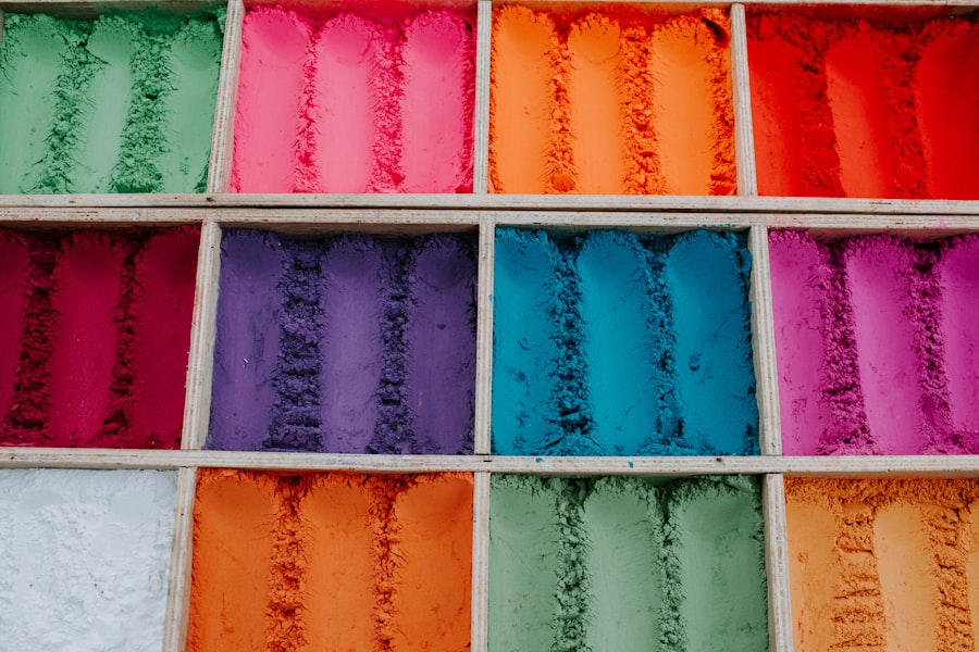
Choosing the Right Color Palette for Your Website
Selecting an appropriate color palette for a website involves more than just personal preference; it requires a strategic approach that aligns with the brand’s goals and target audience. A successful palette typically consists of a primary color that embodies the brand’s essence, complemented by secondary colors that enhance the overall aesthetic without overwhelming the user. Designers often utilize tools like color theory and the color wheel to create harmonious combinations that evoke the desired emotional response.
Furthermore, it is essential to consider the context in which colors will be used on the website. For example, colors may need to be adjusted based on the type of content being presented or the actions users are expected to take. A call-to-action button might benefit from a contrasting color that stands out against the background, drawing attention and encouraging clicks.
By thoughtfully curating a color palette, designers can create an engaging visual experience that resonates with users while fulfilling functional requirements.
How Color Can Affect User Behavior and Emotions
The influence of color on user behavior is profound and multifaceted. Research indicates that certain colors can significantly impact decision-making processes, often leading users toward specific actions. For instance, studies have shown that using red for call-to-action buttons can increase conversion rates due to its association with urgency and excitement.
Similarly, softer colors like green may encourage users to linger longer on a page, fostering a sense of relaxation and comfort. Emotional responses to color are not only immediate but can also have lasting effects on user perceptions of a brand or product. A website that employs a calming blue palette may leave users feeling more at ease, potentially leading to increased trust in the brand.
Conversely, an overly aggressive color scheme might create anxiety or discomfort, prompting users to abandon their visit altogether. Understanding these dynamics allows designers to craft experiences that not only attract users but also nurture positive emotional connections.
The Importance of Contrast and Accessibility in Color Choices
In addition to aesthetic considerations, contrast plays a crucial role in ensuring accessibility for all users. High contrast between text and background colors enhances readability, making it easier for individuals with visual impairments or color blindness to navigate a website effectively. Designers must prioritize accessibility by adhering to established guidelines, such as the Web Content Accessibility Guidelines (WCAG), which provide recommendations for color contrast ratios.
Moreover, incorporating accessible color choices not only benefits users with disabilities but also enhances the overall user experience for everyone. A well-contrasted design allows for clearer communication of information and reduces cognitive load, enabling users to focus on content rather than struggling to decipher text against a busy background. By prioritizing accessibility in color choices, designers demonstrate inclusivity and commitment to creating an equitable digital environment.
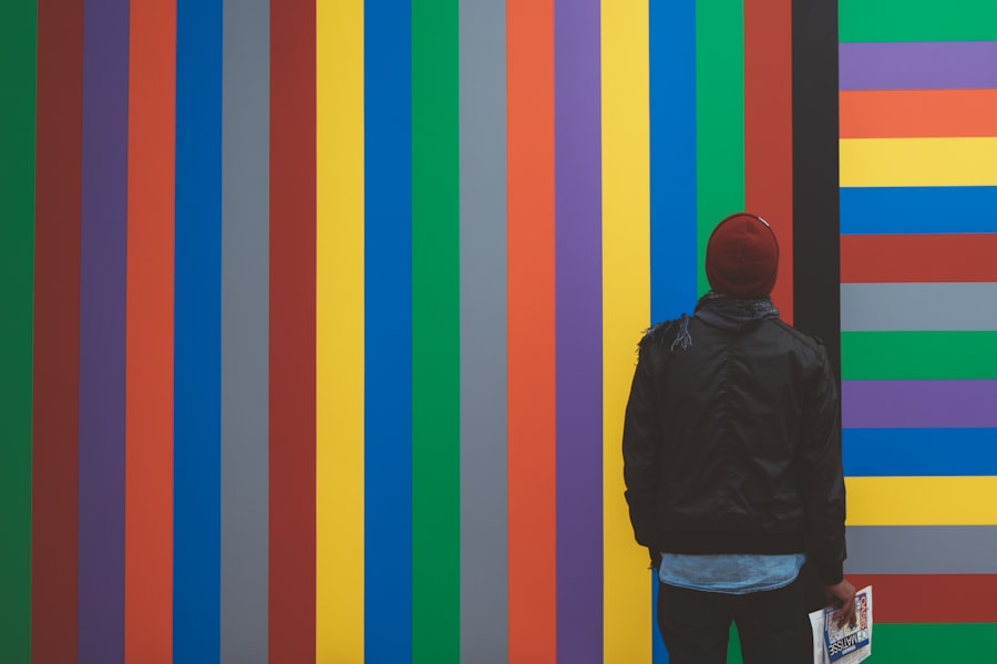
Using Color to Create Visual Hierarchy and Guide User Attention
Color serves as an essential tool for establishing visual hierarchy within web design. By strategically employing different colors for headings, subheadings, and body text, designers can guide users’ attention toward key information and actions. For instance, using a bold color for headings can help them stand out against more muted background elements, allowing users to quickly scan content and identify relevant sections.
Additionally, color can be used to signify importance or urgency within a layout. For example, alert messages or notifications may utilize bright colors like red or yellow to draw immediate attention from users. This intentional use of color not only enhances usability but also creates a more engaging experience by directing users’ focus where it is needed most.
By mastering the art of visual hierarchy through color, designers can create intuitive interfaces that facilitate seamless navigation.
The Future of Color Trends in Web Design
As technology continues to evolve, so too do color trends in web design. Emerging technologies such as augmented reality (AR) and virtual reality (VR) are reshaping how designers approach color selection and application. In these immersive environments, color takes on new dimensions as it interacts with 3D elements and dynamic content.
Designers must adapt their strategies to create cohesive experiences that leverage color effectively within these innovative frameworks. Furthermore, sustainability is becoming an increasingly important consideration in design choices, including color palettes. As consumers become more environmentally conscious, brands are seeking ways to reflect their commitment to sustainability through their visual identities.
This trend may lead to a rise in earthy tones and natural hues that evoke a sense of connection to nature. In conclusion, the impact of color on user experience is profound and multifaceted. From influencing emotions and behaviors to shaping branding and identity, color serves as an essential element in web design.
As designers continue to explore new technologies and trends, understanding the principles of color theory will remain crucial in creating engaging and effective digital experiences for users around the world.
If you’re interested in enhancing your email marketing strategy, you may want to check out this article on Email Marketing Automation: Building Sequences That Convert. This piece delves into the importance of creating automated email sequences that effectively engage and convert your audience. Just like how the psychology of color can impact user behavior on a website, strategic email marketing automation can also play a crucial role in driving conversions and building customer relationships.
FAQs
What is the psychology of color in web design?
The psychology of color in web design refers to the study of how different colors can impact the emotions, perceptions, and behaviors of website visitors. It involves understanding the psychological effects of colors and using this knowledge to create a specific emotional response or convey a particular message through the design of a website.
How do different colors impact emotions and perceptions?
Different colors can evoke different emotional responses and perceptions. For example, warm colors like red, orange, and yellow are often associated with energy, warmth, and excitement, while cool colors like blue, green, and purple are often associated with calmness, trust, and stability. Understanding these associations can help web designers choose colors that align with the desired emotional and perceptual impact of a website.
What are some common associations with specific colors?
Some common associations with specific colors include red for passion, energy, and urgency; blue for trust, calmness, and professionalism; yellow for optimism, warmth, and clarity; green for growth, health, and nature; and purple for luxury, creativity, and wisdom. These associations can vary based on cultural and individual differences, but they provide a general framework for understanding the impact of colors.
How can web designers use the psychology of color in their designs?
Web designers can use the psychology of color in their designs by strategically choosing colors that align with the goals and messaging of a website. This can involve using specific colors to evoke certain emotions, create a cohesive brand identity, guide user attention, or differentiate between different sections of a website. Additionally, designers can use color contrasts and combinations to create visual interest and improve readability.